Was anyone else annoyed by the use of this image, below, on the front page of today’s New York Times?
The image is being used to illustrate an article on “death by Powerpoint“, or the overuse of linear, bullet-pointed presentation methods in today’s information-drenched warfare.
I have no quarrel with the reporting in the article itself —
We need to pay attention to the concern that the Army might be overusing bad visual presentation formats (like PowerPoint, unlike Presi) that inadvertently force an inauthentic, unreal simplicity and ‘logic’ onto complex situations.
PowerPoint presentations, in the wrong hands and inexpertly wielded, are weapons of knowledge destruction. They destroy the complexities of a system of knowledge by chopping it into phrases marked with asterisks.
Bullet Points = Weapons of Knowledge Destruction
PowerPoint presentation formats push presenters to reduce and ‘streamline’ the information they want to share, usually eliminating important detail and suggesting a rationality and linearity that don’t always exist in the information itself.
This is a problem for our military leaders and for us (not to mention, the people of Afghanistan). We want our military leaders to have good information, rich solid information, that is easy to understand. We want them to have information that leads to knowledge, and that can help them capture and share wisdom. And, we want them to spend their time leading, not figuring out how to animate the bullet points and sync the slide transitions to the overture of Götterdämmerung.
Wrong Image = Complexity Fail
There are two important problems with using this particular image to illustrate the problems of over-reliance on PowerPoint.
I. This is not an illustration of a typical PowerPoint slide.
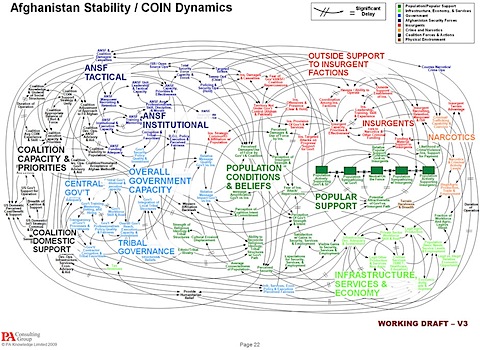
It’s an illustration of a kind of mind map, called a “causal loop diagram”.
There are significant conceptual and practical differences between the mind maps and your typical bullet-pointed PowerPoint slide.
Bullet point slides are great for presenting data that has its own internal organization… such as steps in a process, the outline of an argument, or a plan of attack. These slides offer a ‘topline’– no detail, “just the summary Ma’am“. They are great ways to present some kinds of information.
Mind maps are different– their primary function is to show complexity.
Mind maps are not about steps, they are about webs and networks. In mind maps, there are no beginnings and no ends. Instead, there are relationships. Interactions. Collateral effects. Repercussions.
Mind maps are used to help with problem understanding and problem solving. Mind maps are not designed to help “transmit” information or propose an argument. (Although, of course, mind maps are rhetorical devices. They are just harder to deploy in that way, compared to bullet pointed outlines).
2. This particular image, a causal loop diagram, is actually a terrific example of good visual analysis.
Causal loop diagrams are a very useful tool for understanding complex systems. (By definition, systems cannot be explained by linear, hierarchical tools.)
These diagrams help us untangle complicated relationships– some of which actually ‘exist’ and some of which are what we ‘assume’. One we get these assumptions out onto the diagram, we can interrogate them and see what links can be verified and what links cannot.
This diagram is nothing to laugh at, and nothing to make fun of. This diagram is something to celebrate, because it shows us that our military leaders are trying to take a systems approach to the complex problems in Afghanistan. The opposite of a laughable waste of energy, this particular causal loop diagram has been held up (in scientific circles) as a masterful example of how to make complex systems simple enough to understand.
Like any graphical illustration, a mind map is not a perfect representation of what’s ‘out there’. It is an effort by by folks who are creating it so show what they understand about a situation. Mind maps don “tell us” “that” things are related, but they do tell us what we think is related– and they invite us to think more closely about what else might be influenced if we take an action in one place or another.
Mind maps and causal loop diagrams are EXACTLY the kind of graphics that our military leaders should be creating, should be sharing, and should be using. This is not the kind of visual presentation that’s part of ‘death by PowerPoint.’ This is the kind of analysis that might save lives.
Without analysis and diagrams like these, how will the military (or anyone else) understand the influence of an action directed at “Narcotics” on the situation over there in “ANSF Institutions”?
So, a wag of the finger to the editor over at the New York Times.
The editor made the mistakes of assuming that this image was an example of some kind of analytic overkill, and that this causal map has any link at all to the problems of death by PowerPoint.
There must have been a million images of slides with too many bullets that are too closely spaced and too inanely organized, any of which the editor could have chosen to illustrate ‘death by Powerpoint”. What we have, instead, is actually a useful, well-done causal loop diagram here to show us, what, that the situation in Afghanistan is complex? Like somehow, knowing it’s complex is a problem?
Why did the editor chose this chart, the wrong kind of chart, as an illustration? Maybe the editor’s choice tells us how little most folks know about how to use images (slides, outlines, diagrams, mindmaps, whatever) to share complex information. Maybe, if s/he’d used an image with bullet points, we’d have assumed the situation was under control, and therefore nothing to worry about?
What we did miss, with this illustration, was a chance to consider how PowerPoint really does lead to oversimplification. And, we missed the chance to consider the real complexity of the situation in Afghanistan, something that too many would prefer to ignore.
What a shame.
See also:
Enemy Lurks in Briefings on Afghan War – PowerPoint – NYTimes.com
Introduction to Mind Mapping: a tool to help you be more creative …
We Have Met the Enemy and He Is PowerPoint – At War Blog – NYTimes.com
For more on the diagram itself, see:
- So what is the actual surge strategy? Richard Engel, NBC News Chief Foreign Correspondent, December 02, 2009:
The slide is undoubtedly overwhelming. For some military commanders, the slide is genius, an attempt to show how all things in war – from media bias to ethnic/tribal rivalries – are interconnected and must be taken into consideration. It represents a new approach to war fighting, looking beyond simply killing enemy fighters. It underscores what those fighting wars have long known, that everything matters.
- Mark Vallen at Art For A Change: COIN Pentagon Postmodern considers the mind map as a kind of ‘art’.
 I am an organizational consultant, change advocate, and organizational identity/reputation scholar with a PhD in leadership & organizations. I research, write about, and consult with organizations on the relationships between organizational identity, actions, and purpose. I teach Technology Management, part-time, at Stevens Institute of Technology.
My current research focuses on how social technologies in the workplace can drive organizational change, generate meaning, and catalyze purpose. See the
I am an organizational consultant, change advocate, and organizational identity/reputation scholar with a PhD in leadership & organizations. I research, write about, and consult with organizations on the relationships between organizational identity, actions, and purpose. I teach Technology Management, part-time, at Stevens Institute of Technology.
My current research focuses on how social technologies in the workplace can drive organizational change, generate meaning, and catalyze purpose. See the
{ 4 comments }
I, too was caught by this misalignment this morning.
looking at it, I recalled a story from around the time of Saddam Hussein’s capture about the methodology of the team who found him. They were celebrated for the development of a large board (typical, it seems to the cop shows) of various types of information (a physical mind map) that carefully captured, analyzed, made linkages and built understanding that allowed them to be successful in their objective. No Powerpoint for them!
So this diagram was a representation, it seemed, of that intelligence legacy. Not the reduction of a complex subject down to 3 bullets, but the exploration of the intricate network of social, cultural, economic, historical, factional and strategic interests that illuminate how war is no longer binary, and how “winning” is a measure of the successful implementation of a new order and institution building that takes form long after the arrogance and brutality of shock and awe.
The information in and implied by this diagram would have been impossible to present in Powerpoint, but is a powerful resource outside of it. It is an illustration of a great alternative to Powerpoint and way off base as an illustration of it.
Thanks for your observations!
I found this post after doing a google search to find that diagram, which has haunted me since I saw it a few days ago. You’re absolutely right about this — have you seen the work of Mark Lombardi? (http://www.pierogi2000.com/flatfile/lombardi.html) He takes the idea of mind mapping complex systems to a whole new level. I was reminded of the film “The Fog of War” — how complex it is to try and decipher a constantly shifting battlefield. I’m curious about the “artist” of this diagram — he/she should definitely get more credit.
Hi Kay,
Thanks so much for your comment and for the link to Mark Lombardi’s work!
It’s so interesting to see how this image, and related stories, have traveled across the media. Only yesterday I saw (Tivo-delayed) The Daily Show segment on the graph, which like most commentary ‘got it wrong’. But, they redeemed themselves with an achingly funny montage of famous film exhortations of war strategy (e.g. Patton, Braveheart) bullet-pointed and diagrammed. If you find any good analyses where someone goes through the image seriously, explaining it rather than making fun of it, I’d love to know. cv
Thanks, CV. You’re spot on! I felt the same annoyance. I’ve been a Systems Dynamics fan since I had the privilige of attending a seminar at MIT with Jay Forrester as keynote speaker back around 1980. I applaud the military for enbracing this thinking and having the courage to act on counter-intuitive recommendations that attempt to take complex causal feedback loops into consideration — like, broadcast the time of attack well in advance… and make killing fewer of the enemy an objective. Fortunately, sharp officers like Patraeus and McCrystal “get it” and fund such studies.
I felt the same annoyance when I first heard the words “no child left behind.” The only way to achieve “no child left behind” is to slow the parade down to the slowest child. We need to study a well prepared SD causal loop diagram of education to better understand why as 7 in 10 high school grad go directly to college and the college graduation rate now accelerates (accelerates!) past the 33% mark for all US citizens over 25… while at the same time the percentage high school grads actually prepared for college shrinks below 20% AND the percentage of college graduate able to score competent on literacy tests has declined from 40% in 1993 to 31% in 2003. At the current rate, in 30 years everyone will have a baccalaureate degree and nobody will be able to score competent on literacy tests.
Are survival minded professors the mortgage brokers of the sub-prime education meltdown?
Cheers!
Tom
Comments on this entry are closed.
{ 2 trackbacks }